Our bathroom is DONE! When we moved into this house 3 years ago, the main bathroom was the room that needed the most work. It was super dated, and in rough shape. Unfortunately, bathroom renovations can be expensive, and this thing needed a full gut… We got by with a DIY refresh for a few years, but I was so excited to finally give our bathroom the love it so desperately needed.
I partnered with Vintage Tub & Bath on this remodel, and I’m so excited to share the final product. It was SO worth the wait!
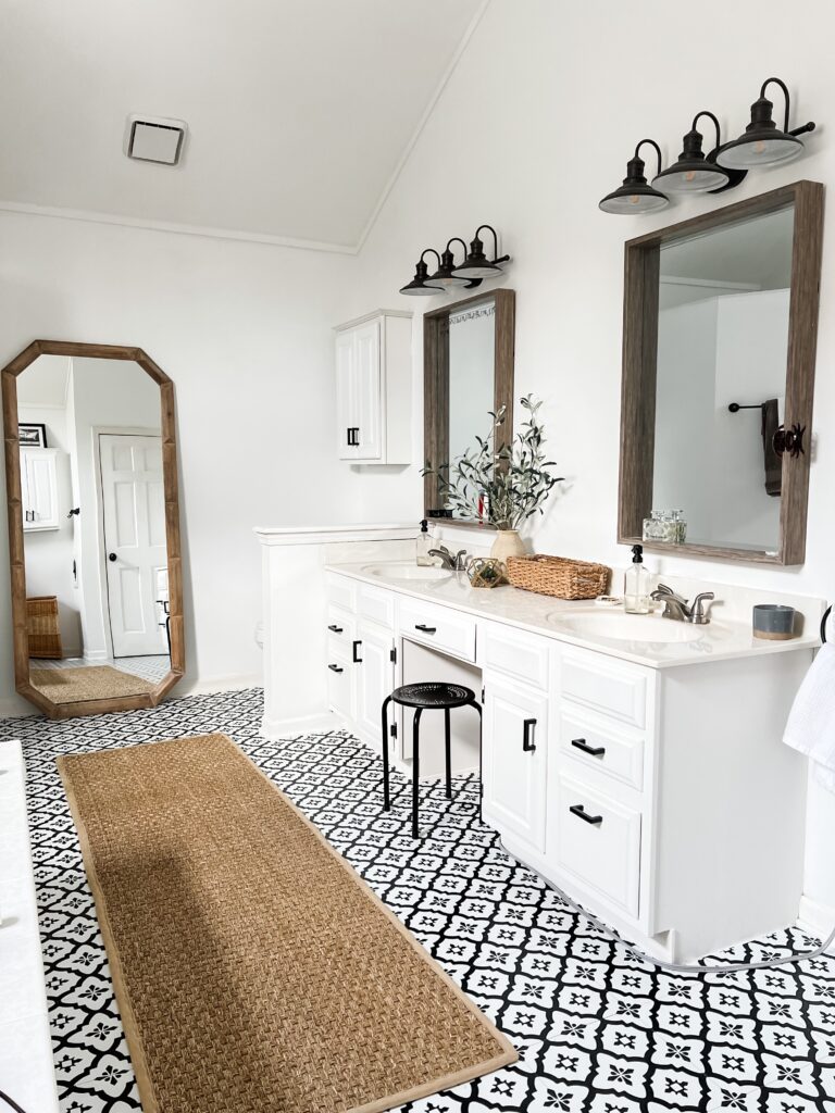
To get a full picture of just how far this room has come, let’s take a peek at what it looked like before! It was super dated, but really large and functional, and I knew there was a ton of potential.
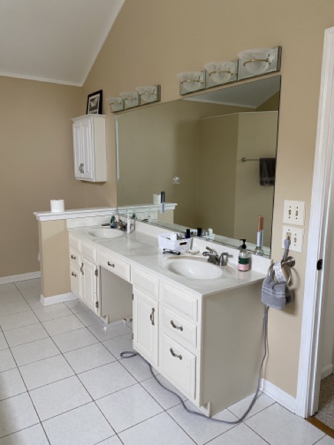
Shortly after we moved in, I decided to make some easy DIY updates to make the room more livable. I painted all the walls and vanity bright white, swapped the lights, cabinet hardware and mirrors, and added peel and stick tiles over the existing floors. Just those changes made a HUGE difference, and made it so much more enjoyable to be in there.
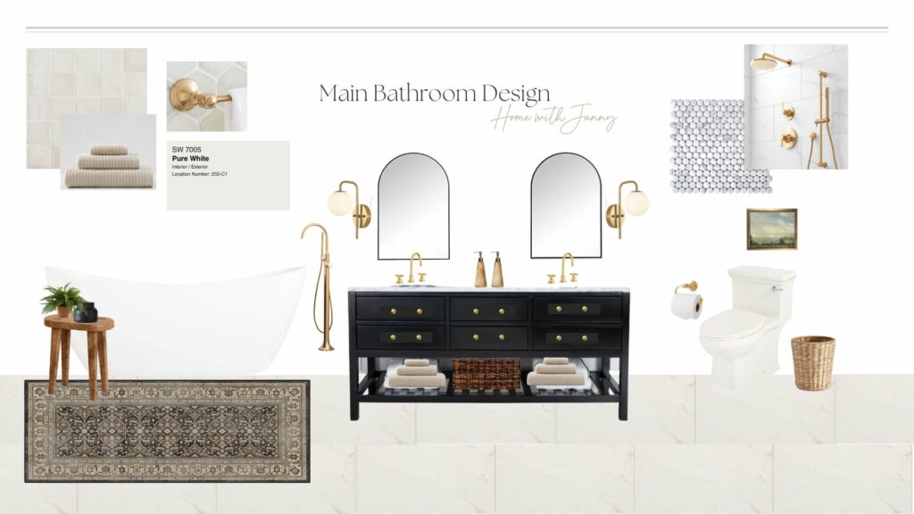
After saving up and dreaming about what this bathroom could be for 3 years, we were finally ready to take on a full renovation! I shared more details on our plans in this post, but here is the mood board that I put together before we got started.
Ok ok, enough talk, let’s get to the good stuff…
The Bathroom Vanity

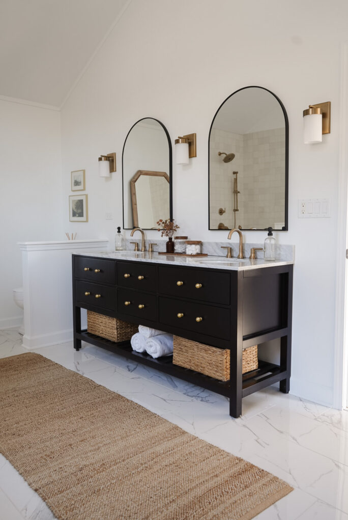
Vanity | Knobs | Faucets | Baskets | Mirrors | Sconces | Runner Rug
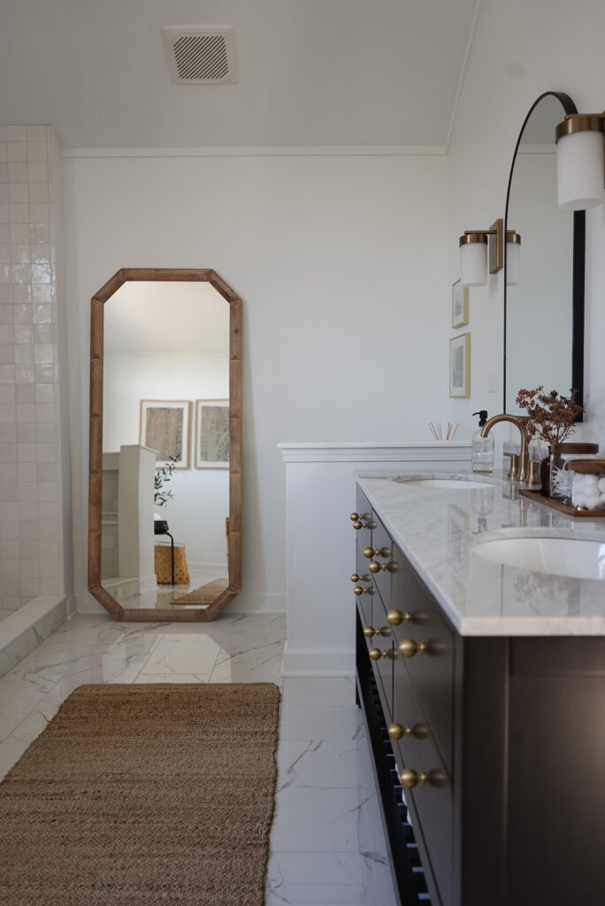
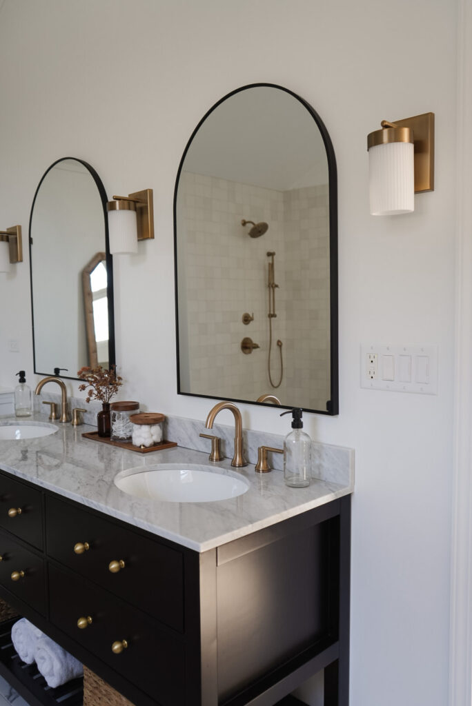
I was initially thinking that I would want a wood toned vanity for in here, but I am SO glad I changed my mind and went with this black beauty from Vintage Tub. The vanity comes with chrome pulls, but I swapped those out for these gold knobs I found on Amazon (same ones we use in our kitchen), and it made a HUGE difference! I love that this vanity has legs and feels like a beautiful piece of furniture, and the drawers and baskets I added baskets to the bottom shelf have been great for storage. I wanted to add more warmth next to the white walls and black vanity so went with gold tones on the faucets and sconces as well. The black arched mirrors added some drama, and I think they are the cherry on top.
A Cute Toilet Moment
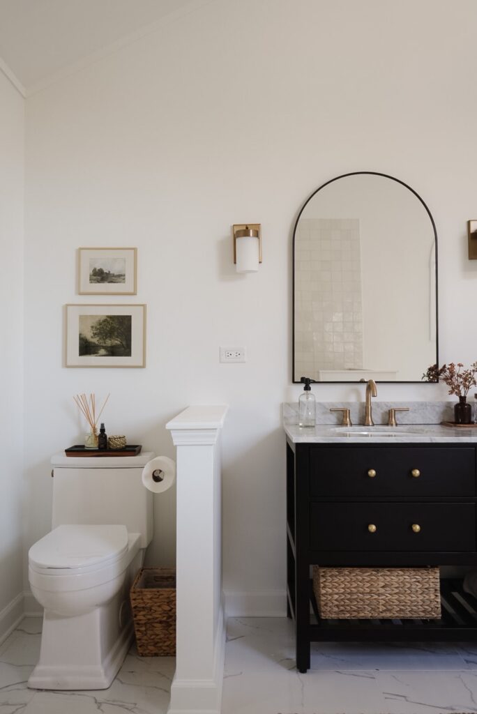
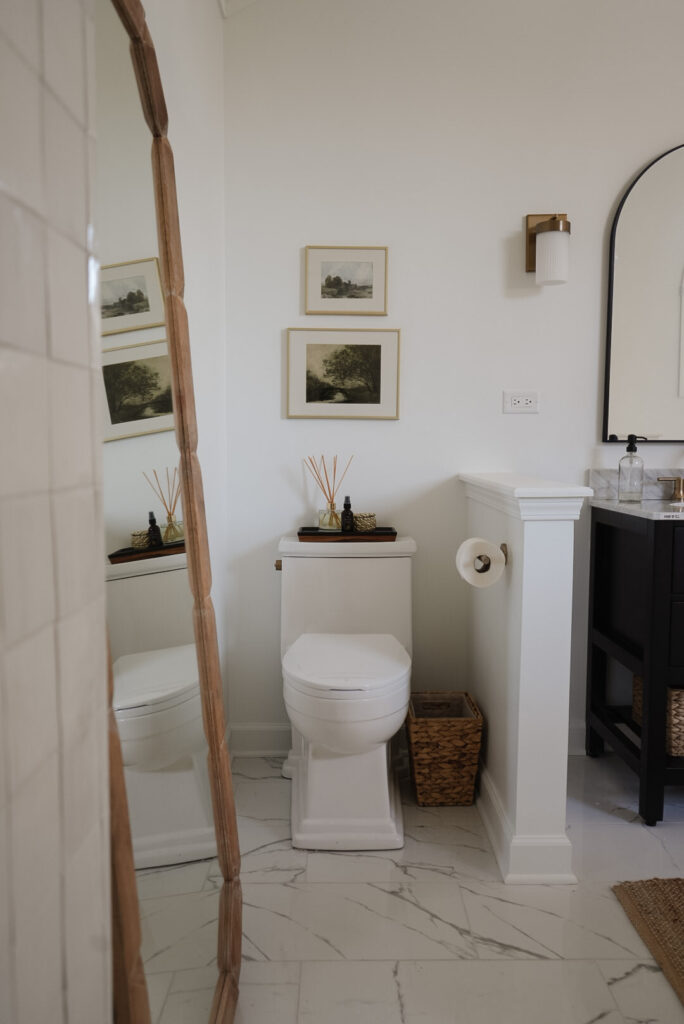
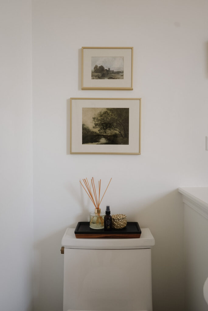
Toilet | Top Art Print | Bottom Art Print | Sconce | Basket
It might sound weird, but honestly, this little toilet moment is one of my favorite parts of this room. We found a really simple, streamlined toilet and added a few special touches to make it feel a bit more special and intentional. I grabbed a couple of pretty vintage looking prints from Juniper Print Shop and used frames I already had. I kept with the theme of adding warmth here with the woven garbage can and wood accent on the tray on top of the toilet.
The Tub
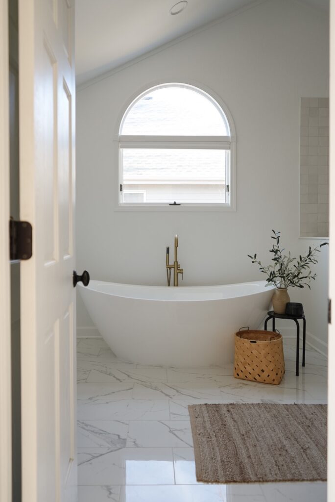
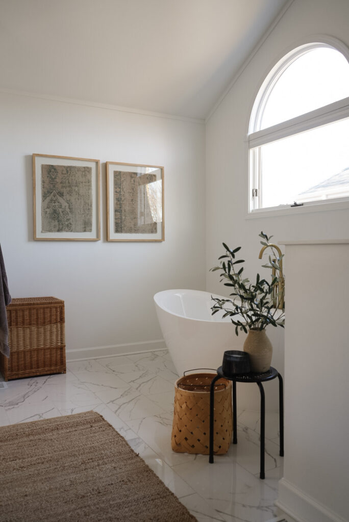
I am just smitten by this tub. It’s just so dang beautiful. I might be converted to a bath person and my kids have refused to bathe in their own bath since this one went in! The tub filler with hand shower was such a great choice and has made bathing them and rinsing the tub out afterward so easy. Plus, its really pretty to look at!
The Shower
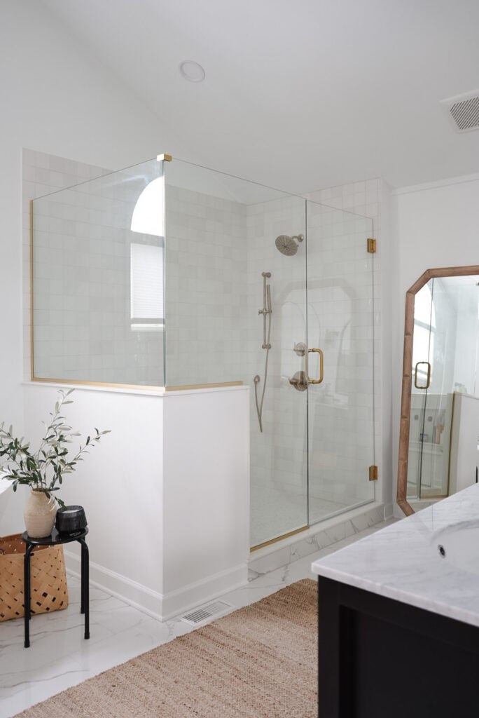
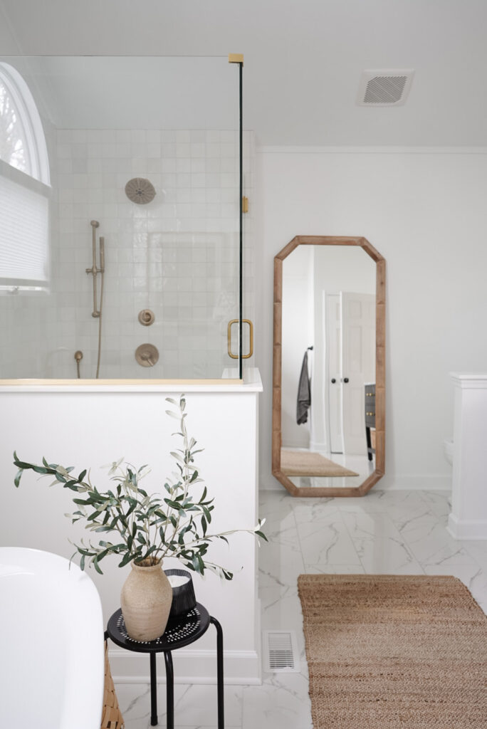
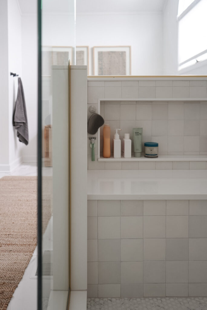
Shower Head | Diverter | Hand Shower | Surface Mount Kit
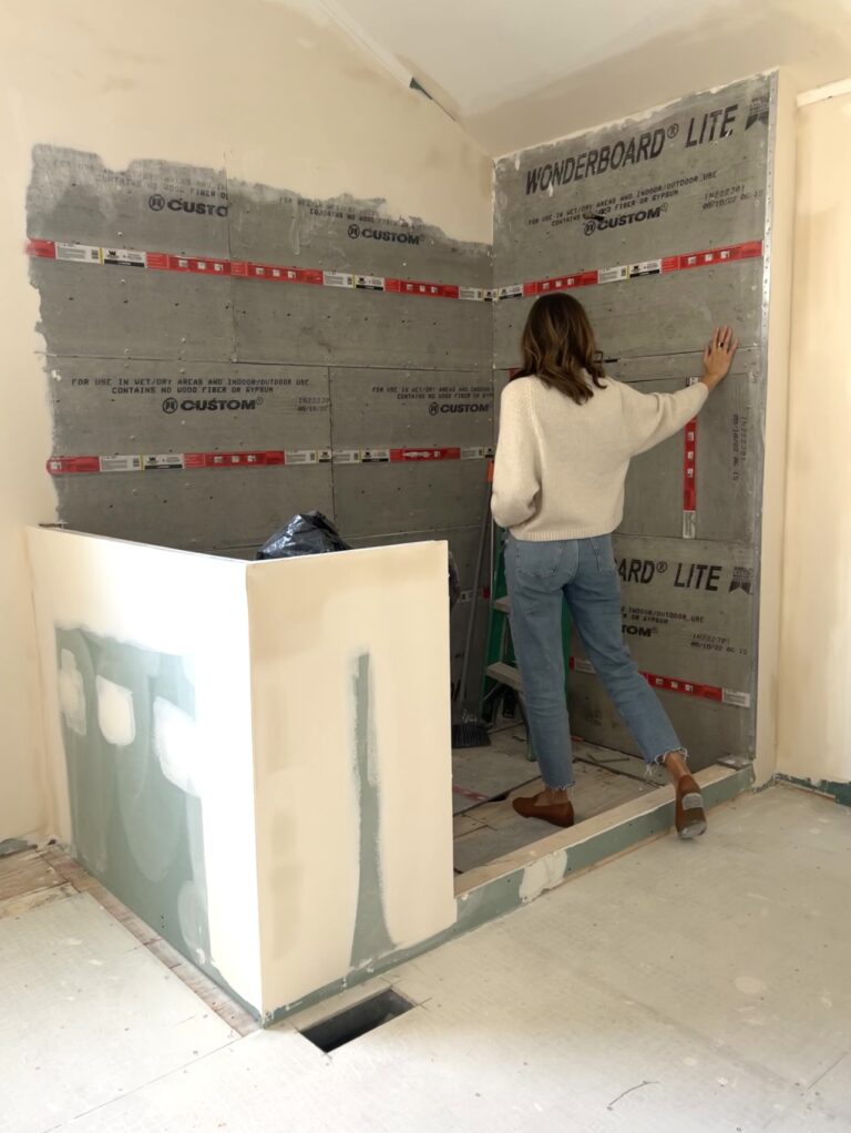
The shower was one of the parts that I was most excited about. Our old shower was basically a locker room shower hidden behind a wall with old cracked white tile and grout that was in terrible shape. I don’t really think I felt “clean” after being in there (just kidding… sort of). We went with a square Zellige tile in a stacked pattern on the walls and I just love the natural variation in color and texture. For the floor, we chose penny round tiles, and I love how it feels underfoot when you are in there.
The champagne bronze shower head and hand shower are so beautiful in there, and it truly feels like a treat every day when I shower in here. We did a bench and hidden shower niche on the other side of the shower, and I love that we don’t have to look at all of our shower supplies when we are elsewhere in the bathroom.
Other details
I just love how it all came together! Here are a few more angles because why not!
What do you think!? Let me know in the comments!
